Probabilistic Delivery Forecasting for Product Managers
Richard Faint on probabilistic forecasting for product management: why fixed deadlines mislead and how to forecast delivery with ranges and confidence.
7 min read →Article
What Monty Python, Douglas Adams and Groundhog Day can teach us about uncertainty, probability and Monte Carlo analysis
By Richard Faint · 19 September 2026 · 5 min read
Last updated
On screen
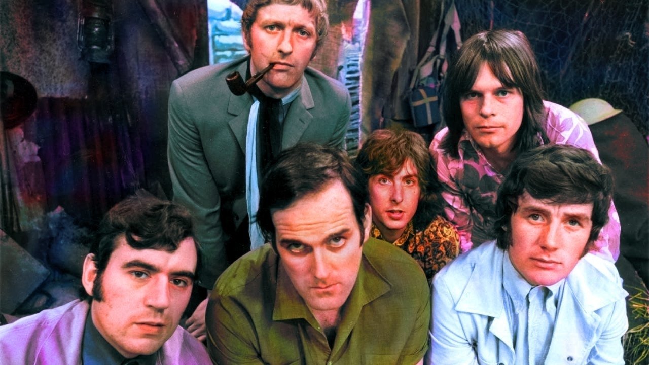
A statistical distribution describes which outcomes are possible and how likely they are but people struggle to understand them. Everyday examples and familiar stories give people a way into that idea before introducing the maths, whether through Monty Python’s chocolates, motorway delays or Hitchhikers Guide to the Galaxy. Different distributions describe different patterns of uncertainty.
This article was inspired by a conversation at an Operations Research conference about how difficult it can be to explain a distribution to someone who is not mathematical. What makes it hard is the way we introduce it, jumping immediately to the technical before giving the person a mental model.
Analogy helps, a good analogy does not replace the maths, but it gives a conceptual foothold. A distribution is just a description of what outcomes are possible and how likely each one is. If you ask how long your journey to work takes, the answer is not 40 minutes as sometimes it takes slightly less time and sometimes significantly longer. Those journey times form a distribution, and the interesting part is the shape that emerges.
The most familiar distribution is the normal distribution, represented by the bell curve. Adult height is a decent example most people cluster somewhere around the middle, while very short and very tall people become less common as you move towards the extremes.The important idea is not the equation behind the bell curve, but the behaviour it describes: ordinary outcomes are common, while extreme outcomes are relatively rare.
An illustrative adult-height distribution, with most people near the middle and fewer towards either extreme.
A value on either side of the centre has the same density as its mirror image. This is a model shape, not measured height data.
A uniform distribution is different because every possible outcome has the same chance of being selected.
Imagine the Whizzo Quality Assortment from Monty Python’s Crunchy Frog sketch. Suppose the box contains equal numbers of six varieties and you blindly select one and are equally as likely to get a crunchy frog as any of the other chocolates
If we took the bones out it wouldn’t be crunchy would it?
That is a discrete uniform distribution, because the outcomes are separate categories. A fair die roll works in exactly the same way. One, two, three, four, five and six each have the same probability, so three is no more “normal” than six.
This is important because we often instinctively expect uncertainty to gather around some central value, but sometimes the correct model really is that anything within a particular set or range is equally plausible.
For a fair die, each result has probability one in six. No result is more typical than another.
These are separate categories, so the diagram uses six bars. Each bar has the same probability: 1/6.
Journey times an example of a skewed distribution. You can only arrive so much earlier than expected as there is a fixed minimum time even if zero delays occur but there’s no equivalent ceiling on lateness. A normal 40-minute journey might occasionally take 30 minutes, yet an accident, roadworks, flooding or bad weather could easily push it towards 90 or even 12 days as was the case in a 2010 traffic jam in China. That lopsided shape is called positive, or right, skew. The lower limit helps explain this example, but skew simply means asymmetry; a hard boundary is not required.
Project durations and costs often behave the same way. A task estimated at five days might occasionally finish in four, but if something goes badly wrong it could take ten or twenty. The uncertainty is not balanced around the average, which is why simple averages can create a false sense of symmetry.
Most journeys are fairly short, but the tail extends towards much longer journeys.
This illustrative model has a 20-minute minimum and a peak at 30 minutes. The long right tail makes unusually late arrivals possible; skew describes the asymmetry.
Sometimes a dataset does not have one centre at all. Imagine analysing travel times into an office when half the workforce drives and half travels by train. One group might cluster around 30 minutes and the other around 55, potentially producing two distinct peaks.
That is a bimodal distribution, and it often tells us that we may be looking at two different populations. The same pattern can appear in customer behaviour, product usage, delivery performance or manufacturing data.
A bimodal chart should make you suspicious of averages because the average may describe nobody. If two equally sized groups average 30 and 55 minutes, the overall mean is 42.5 minutes, even if hardly anyone’s journey takes that long.
Two equally sized groups cluster around 30 and 55 minutes. Their combined mean is 42.5 minutes.
The gold line marks the overall mean. It sits in a quiet part of this distribution, so it describes neither group particularly well.
Skew describes asymmetry, while tail weight describes how much probability remains far from the centre. These are different properties, and a distribution can have both: a pattern can lean strongly to the right and also allow exceptionally large outcomes. Heavy tails can occur in symmetric distributions too, so they do not simply mean “more skew”.
Book sales and social-media views offer an intuitive picture many modest results sit alongside a few spectacular successes. The Infinite Improbability Drive in Douglas Adams’ The Hitchhiker’s Guide to the Galaxy is a memorable prompt to think about extraordinary outcomes, but it is deliberately absurd rather than a statistical model whilst Taleb has talked about Black Swan events which incredibly rate but also transformative. The useful question it leaves us with is whether our model has dismissed something consequential simply because it is unfamiliar. That does not make every imaginable catastrophe likely, and a single spectacular event does not prove a heavy tail.
Compare the chance of reaching a large sales figure in a Pareto model and a light-tailed exponential model.
Here the curve height gives the chance of reaching at least that sales level. At 3× the baseline, it is 19.2% for the Pareto model and 5.0% for the exponential model. Both tails continue beyond the chart. These are illustrative models, not book-sales data.
The danger with distributions is that we often teach the mathematical label before the behaviour. Normal and uniform name particular distributions; skewed, bimodal and heavy-tailed describe properties that can overlap. All become easier to understand once someone can picture the behaviour behind the label.
The mathematics then becomes a more precise language for something the reader already understands intuitively, which is the real value of analogy: not to make the subject less rigorous, but to make the rigour easier to reach.
Try it interactively. Hitchhikers Guide to Distributions — explore distributions via Hitchhikers Guide to the Galaxy